VENMO CONCEPT
Venmo, without borders
Venmo’s users are already global. Venmo isn’t, yet. This case study assumes international payments are enabled and focuses on one experience problem: the difference between what you send and what they receive should never be a surprise.
**Infrastructure, compliance, and regulatory requirements are assumed to be in place.

Outcomes
→
Received amount became the priority
All users identified it as the most important number, confirming the hierarchy shift worked.
→
Full cost understood before authorization
All users chose the redesigned flow over the original experience.
→
Zero abandonment due to cost clarity
All participants completed the payment without pausing or requesting clarification.
**Based on two rounds of moderated usability testing with 10 participants - designers, engineers, business professionals, and international users across diverse backgrounds.
“If Venmo worked like this abroad, I’d stop using everything else. This just makes sense.”
Usability tester,
Product Designer
Same experience, any currency
No surprises before you confirm
Venmo’s international payment flow makes the received amount and total cost explicit before authorization, so the sender knows exactly what they’re paying, and the recipient gets exactly what was intended.
THE INTERNATIONAL PAY FLOW
Every step, accounted for
From amount entry to final confirmation
Full transparency through every step. No reason to pause, second guess, or go elsewhere to verify.
** A video walkthrough is shown here to preserve the integrity of a specific transaction. The experience is built around a set amount and sequence that a static prototype wouldn’t communicate clearly.
Context
Venmo’s simplicity is the product
Venmo works because it’s feels like messaging, not banking. You pay your friend via their handle, not their account number. It feels personal and social which is why people choose it over their bank app.
But Venmo stops at the border
Venmo has over 90 million users, all domestic. The global P2P payments market is projected to reach $16 trillion by 2034. The infrastructure gap isn’t just a product problem, its a missed market.
Today, those 90 million users split dinner in Paris, send birthday money to London, and have family in countries Venmo can’t reach.
When they cross a border, Venmo can’t follow. The need doesn’t disappear because the infrastructure hasn’t caught up yet.
What you send vs. what they get
Two numbers, one transaction
The question isn’t just “what did I send?” it’s, “what will they actually receive?”
Cross-border payments break the ease of domestic payments. What you enter and what is received are no longer the same number.
Senders anchor on what they’re entering, not what lands on the other side. That’s where expectations break down. Without visibility into both, someone always ends up short.
Sent: €1,050
vs.
Received: €1,025
Sent
≠
Received
“Venmo just works in the most simple way possible. If it worked globally and I could trust the rates, I would use Venmo forever.”
Usability tester, Product Design
“Exchange rates and fees are confusing. I just want to know exactly what I’m paying upfront.”
Usability tester, Engineer
How might we show transparency across every touchpoint in the experience?
The flow
Six steps, no surprises
Before diving into each decision, here’s the full journey. Six steps. Two moments where the experience diverges from domestic.
Rates are shownbefore amountis entered
Fees are shown after an amountis entered
1
Tap pay/request

2
Select recipient
3
Select pay
4
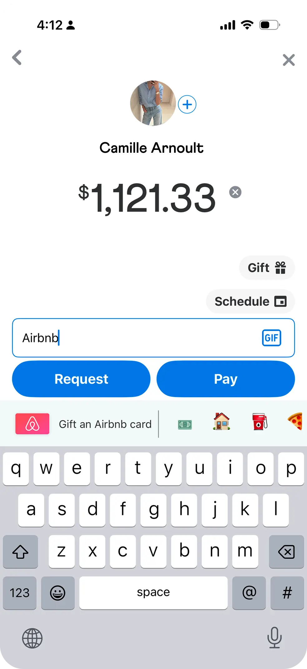
Enter amount
5
Review & confirm
5
Review & confirm
How we got there
Reframing the approach
Most apps lead with the same amount. Our instinct was to do the same.
But in early testing, users kept anchoring on the wrong number. They’d enter an amount, see what they were sending, and only realize after confirmation that the recipient received something different.
The clarity we needed was about hierarchy, and reordering what came first.
What’s your intent?
Hierarchy wasn’t the only problem. Intent needed to be established before the flow could begin.
Venmo’s domestic flow presents pay and request as equal choices. They’re opposite actions with equal visual weight and presenting them together is how misdirected requests happen. On a platform built around social trust, a misdirected request is an awkward interaction.
A segmented control at the start of the flow resolves this. Intent is declared before anything else. Everything downstream is built around one clear direction.
Request or Pay
Decided before the flow begins
Request
Pay
Domestic
vs.
International
Before
Pay and request compete
After
Pay or request decided before the flow begins
Shift the reference point
Leading with the sent amount anchors the sender on the wrong number. Internationally, the sent and received amounts are never the same.
If the goal is to ensure the recipient gets exactly what they’re owed, the hierarchy needs to flip. Here, the received amount leads.
Domestic
vs.
International
Before
What you send is what they get
Pay
Green signals final. But, the label doesn’t.
After
What they get, first
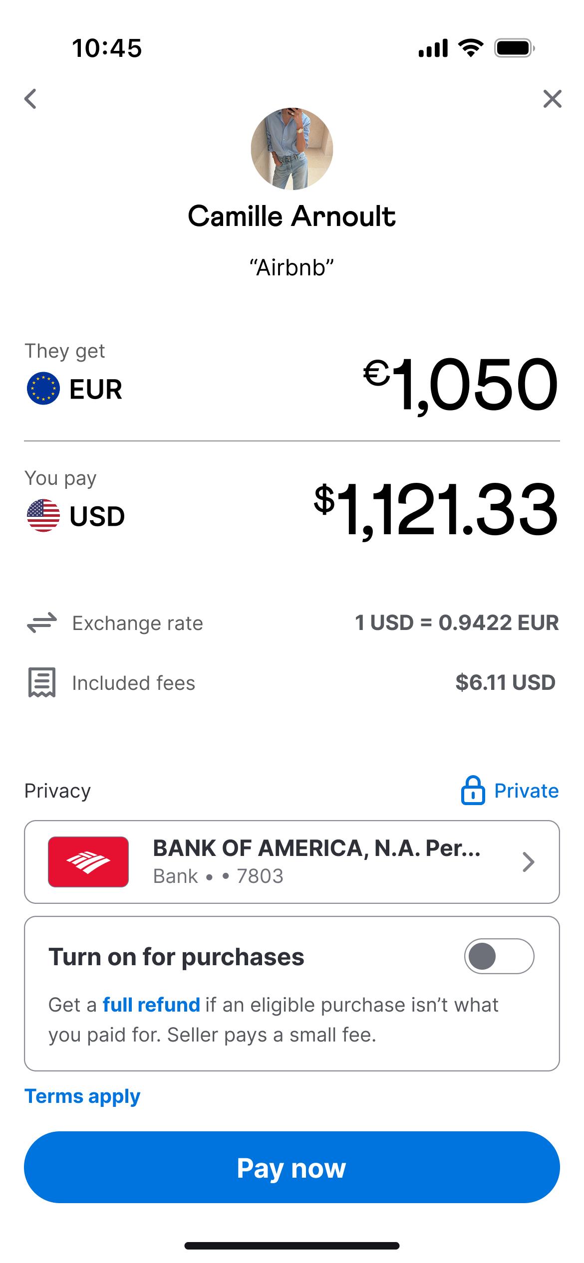
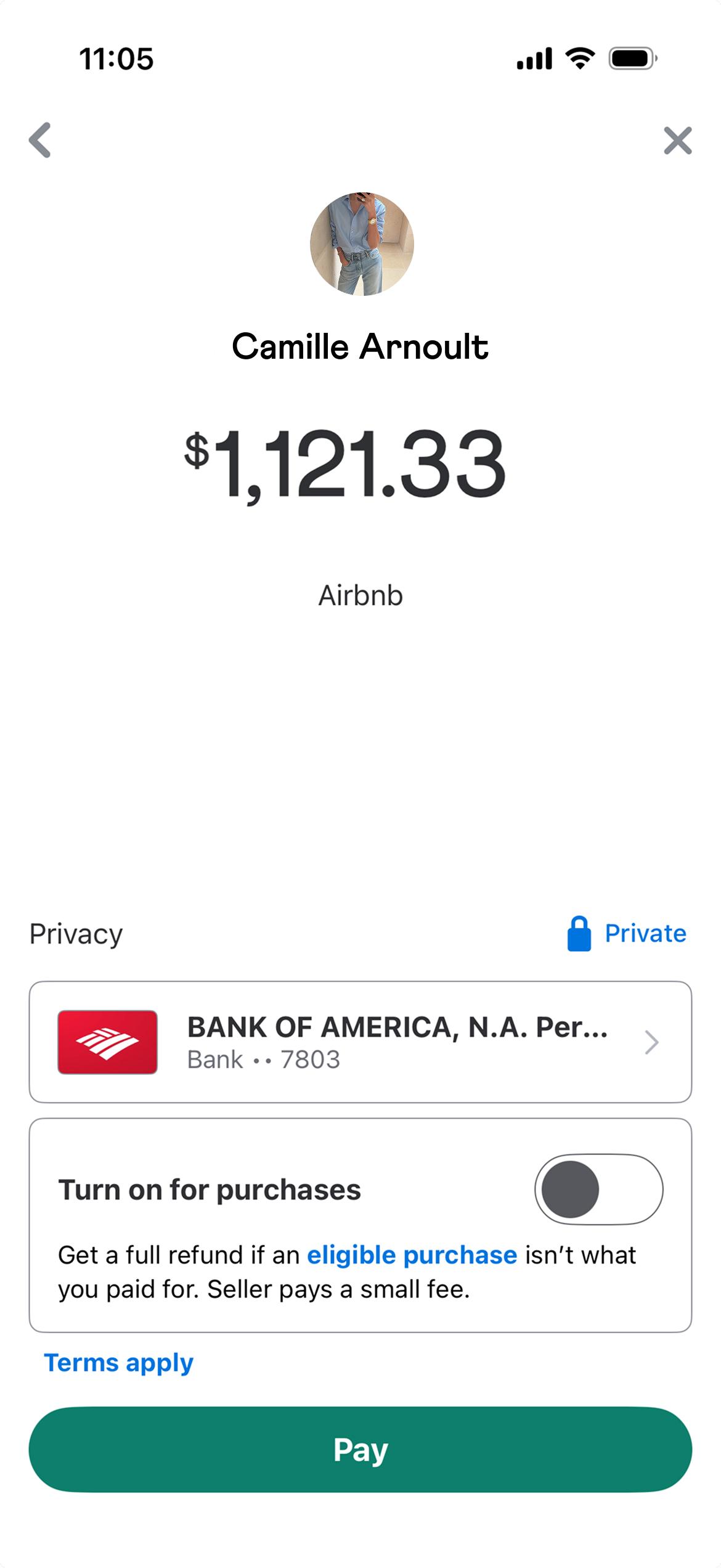
Pay now
Urgent & actionable. Color aligned to Venmo blue.
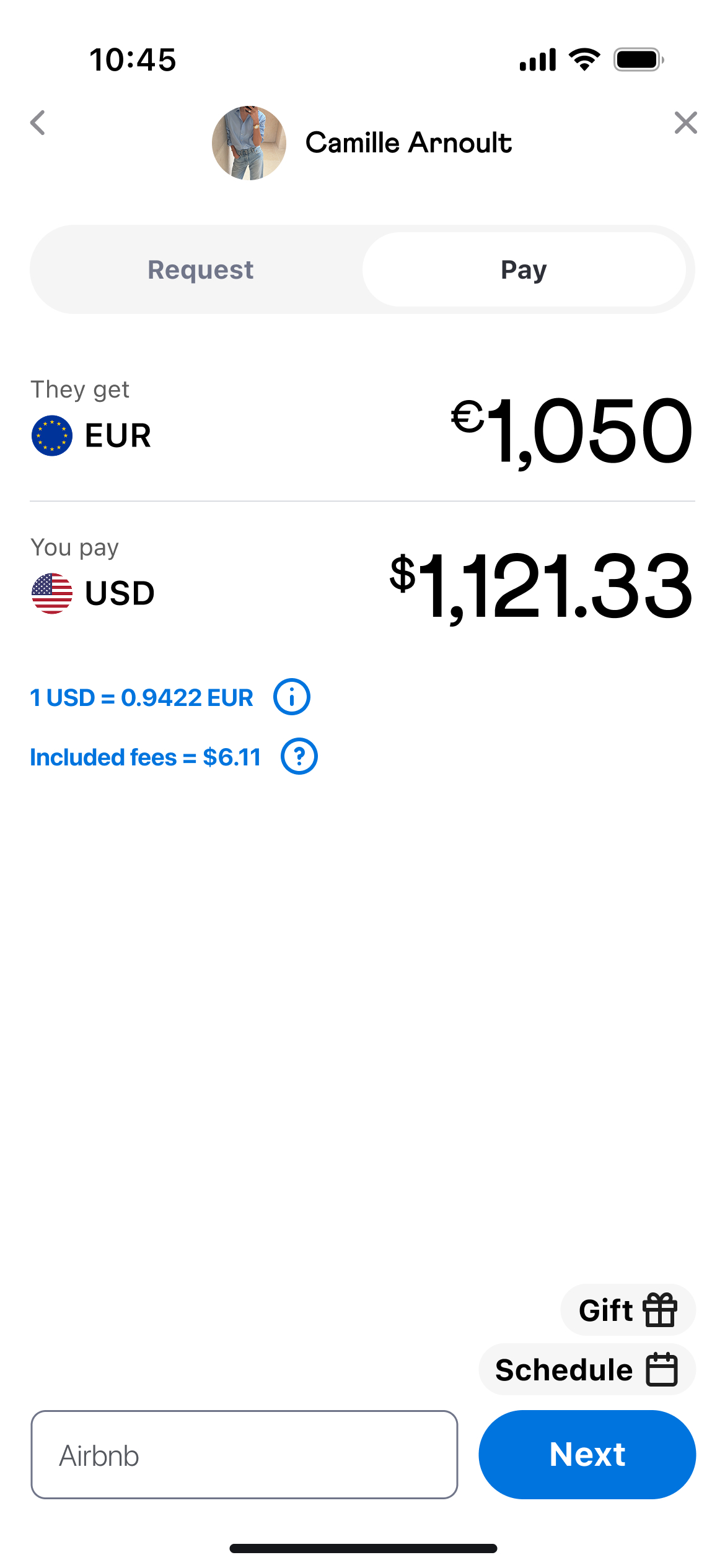
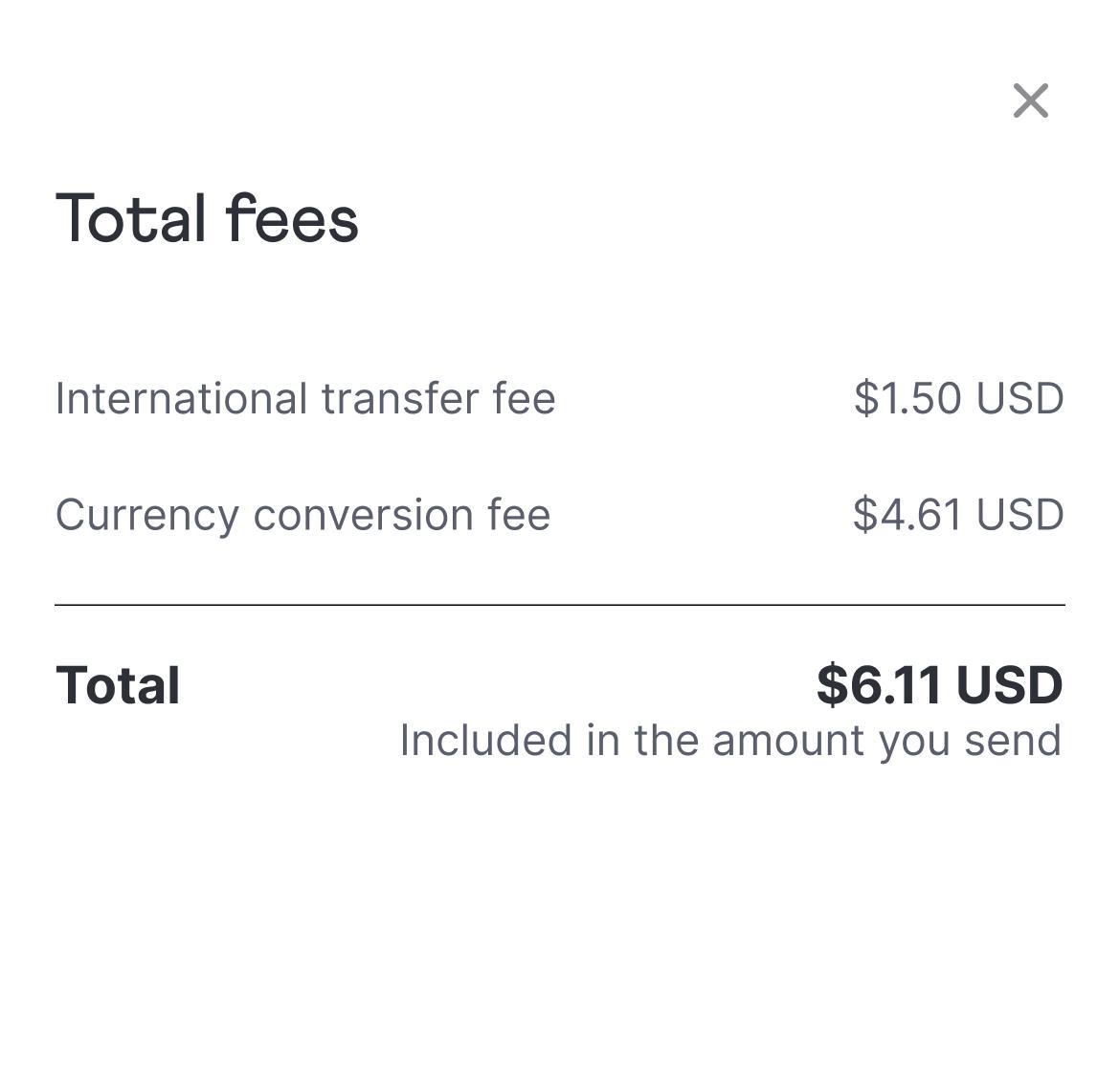
Full visibility before authorization
The exchange rate is shown alongside a 30-day history, so the sender can evaluate the rate without leaving the app.
Fees are broken down as two distinct line items: international transfer fee and currency conversion fee. So, the sender knows exactly what they’re paying and why.
By authorization, nothing is new. Each variable has already been seen and understood before the final screen.
No markups, no guessing.
The mid-market rate, the fairest benchmark available is shown alongside a 30-day history.
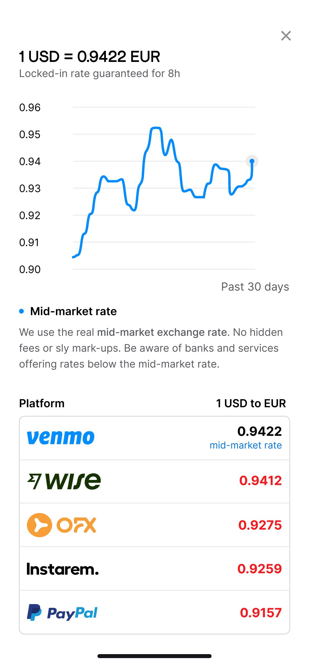
Every fee, broken down.
The sender knows exactly what they’re paying before they confirm.
What this unlocks
What clarity actually brings
When the total cost is explicit before authorization, there’s no confusion on what is received vs. what is sent.
Hesitation drops because there’s no doubt, so payments complete the first time.
The next time the user faces a cross-border transfer, they reach for Venmo instead of switching to another app.
“This feels like Venmo, but smarter. I would actually use this when traveling with my friends.”
Usability tester,
Engineer
Next case study
-->
AXIS
Turning exploration into clarity
→
Every user left with a new connection
→
88% adoption rate
→
42% increase in engagement
Mobile design
End-to-end experience
View case study
VENMO CONCEPT
Venmo, without borders
Venmo’s users are already global. Venmo isn’t, yet. This case study assumes international payments are enabled and focuses on one experience problem: the difference between what you send and what they receive should never be a surprise.
**Infrastructure, compliance, and regulatory requirements are assumed to be in place.
Outcomes
→
Received amount became the priority
All users identified it as the most important number, confirming the hierarchy shift worked.
→
Full cost understood before authorization
All users chose the redesigned flow over the original experience.
→
Zero abandonment due to cost clarity
All participants completed the payment without pausing or requesting clarification.
**Based on two rounds of moderated usability testing with 10 participants - designers, engineers, business professionals, and international users across diverse backgrounds.
“If Venmo worked like this abroad, I’d stop using everything else. This just makes sense.”
Usability tester,
Product Designer
Same experience, any currency
No surprises before you confirm
Venmo’s international payment flow makes the received amount and total cost explicit before authorization, so the sender knows exactly what they’re paying, and the recipient gets exactly what was intended.
THE INTERNATIONAL PAY FLOW
Every step, accounted for
From amount entry to final confirmation
Full transparency through every step. No reason to pause, second guess, or go elsewhere to verify.
** A video walkthrough is shown here to preserve the integrity of a specific transaction. The experience is built around a set amount and sequence that a static prototype wouldn’t communicate clearly.
Context
Venmo’s simplicity is the product
Venmo works because it’s feels like messaging, not banking. You pay your friend via their handle, not their account number. It feels personal and social which is why people choose it over their bank app.
But Venmo stops at the border
Venmo has over 90 million users, all domestic. The global P2P payments market is projected to reach $16 trillion by 2034. The infrastructure gap isn’t just a product problem, its a missed market.
Today, those 90 million users split dinner in Paris, send birthday money to London, and have family in countries Venmo can’t reach.
When they cross a border, Venmo can’t follow. The need doesn’t disappear because the infrastructure hasn’t caught up yet.
What you send vs. what they get
Two numbers, one transaction
The question isn’t just “what did I send?” it’s, “what will they actually receive?”
Cross-border payments break the ease of domestic payments. What you enter and what is received are no longer the same number.
Senders anchor on what they’re entering, not what lands on the other side. That’s where expectations break down. Without visibility into both, someone always ends up short.
Sent: €1,050
vs.
Received: €1,025
Sent
≠
Received
“Venmo just works in the most simple way possible. If it worked globally and I could trust the rates, I would use Venmo forever.”
Usability tester, Designer
“Exchange rates and fees are confusing. I just want to know exactly what I’m paying upfront.”
Usability tester, Engineer
How might we show transparency across every touchpoint in the experience?
The flow
Six steps, no surprises
Before diving into each decision, here’s the full journey. Six steps. Two moments where the experience diverges from domestic.
1
Tap pay/request

2
Select recipient
3
Select pay
4
Enter amount
5
Review & confirm
6
Pay now
Rates are shownbefore amountis entered
Rates are shownbefore amountis entered
How we got there
Reframing the approach
Most apps lead with the same amount. Our instinct was to do the same.
But in early testing, users kept anchoring on the wrong number. They’d enter an amount, see what they were sending, and only realize after confirmation that the recipient received something different.
The clarity we needed was about hierarchy, and reordering what came first.
What’s your intent?
Hierarchy wasn’t the only problem. Intent needed to be established before the flow could begin.
Venmo’s domestic flow presents pay and request as equal choices. They’re opposite actions with equal visual weight and presenting them together is how misdirected requests happen. On a platform built around social trust, a misdirected request is an awkward interaction.
A segmented control at the start of the flow resolves this. Intent is declared before anything else. Everything downstream is built around one clear direction.
Request or Pay
Decided before theflow begins
Request
Pay
Domestic
vs.
International
Before
Two competing actions
After
One clear intent
Shift the reference point
Leading with the sent amount anchors the sender on the wrong number. Internationally, the sent and received amounts are never the same.
If the goal is to ensure the recipient gets exactly what they’re owed, the hierarchy needs to flip. Here, the received amount leads.
Domestic
vs.
International
Before
Sent amount leads
Pay
Green signals final. But the label doesn’t.
After
Received amount leads
Pay now
Urgent & actionable. Color aligned to Venmo blue.
Full visibility before authorization
The exchange rate is shown alongside a 30-day history, so the sender can evaluate the rate without leaving the app.
Fees are broken down as two distinct line items: international transfer fee and currency conversion fee. So, the sender knows exactly what they’re paying and why.
By authorization, nothing is new. Each variable has already been seen and understood before the final screen.
No markups, no guessing.
The mid-market rate, thefairest benchmark available is shown alongside a 30 day history.
Every fee, broken down.
The sender knows exactly what they’re paying before they confirm.
What this unlocks
What clarity actually brings
When the total cost is explicit before authorization, there’s no confusion on what is received vs. what is sent.
Hesitation drops because there’s no doubt, so payments complete the first time.
The next time the user faces a cross-border transfer, they reach for Venmo instead of switching to another app.
“This feels like Venmo, but smarter. I would actually use this when traveling with my friends.”
Usability tester,
Engineer
Next case study
-->
AXIS
Turning explorationinto clarity
→
Every user left with a new connection
→
88% adoption rate
→
42% increase in engagement
Mobile design
End-to-end experience
View case study
VENMO CONCEPT
Venmo, without borders
Venmo’s users are already global. Venmo isn’t, yet. This case study assumes international payments are enabled and focuses on one experience problem: the difference between what you send and what they receive should never be a surprise.
**Infrastructure, compliance, and regulatory requirements are assumed to be in place.
Outcomes
→
Received amount became the priority
All users identified it as the most important number, confirming the hierarchy shift worked.
→
Full cost understood before authorization
All users correctly identified the fees and exchange rates without being prompted.
→
Zero abandonment due to cost clarity
All participants completed the payment without pausing or requesting clarification.
**Based on two rounds of moderated usability testing with 10 participants - designers, engineers, business professionals, and international users across diverse backgrounds.
“If Venmo worked like this abroad, I’d stop using everything else. This just makes sense.”
Usability tester,
Product Designer
Same experience, any currency
No surprises before you confirm
Venmo’s international payment flow makes the received amount and total cost explicit before authorization, so the sender knows exactly what they’re paying, and the recipient gets exactly what was intended.
THE INTERNATIONAL PAY FLOW
Every step, accounted for
From amount entry to final confirmation
Full transparency through every step. No reason to pause, second guess, or go elsewhere to verify.
** A video walkthrough is shown here to preserve the integrity of a specific transaction. The experience is built around a set amount and sequence that a static prototype wouldn’t communicate clearly.
Context
Venmo’s simplicity is the product
Venmo works because it’s feels like messaging, not banking. You pay your friend via their handle, not their account number. It feels personal and social which is why people choose it over their bank app.
But Venmo stops at the border
Venmo has over 90 million users, all domestic. The global P2P payments market is projected to reach $16 trillion by 2034. The infrastructure gap isn’t just a product problem, its a missed market.
Today, those 90 million users split dinner in Paris, send birthday money to London, and have family in countries Venmo can’t reach.
When they cross a border, Venmo can’t follow. The need doesn’t disappear because the infrastructure hasn’t caught up yet.
What you send vs. what they get
Two numbers, one transaction
The question isn’t just “what did I send?” it’s, “what will they actually receive?”
Cross-border payments break the ease of domestic payments. What you enter and what is received are no longer the same number.
Senders anchor on what they’re entering, not what lands on the other side. That’s where expectations break down. Without visibility into both, someone always ends up short.
Sent: €1,050
vs.
Received: €1,025
Sent
≠
Received
“Venmo just works in the most simple way possible. If it worked globally and I could trust the rates, I would use Venmo forever.”
Usability tester, Product Design
“Exchange rates and fees are confusing. I just want to know exactly what I’m paying upfront.”
Usability tester, Engineer
How might we show transparency across every touchpoint in the experience?
The flow
Six steps, no surprises
Before diving into each decision, here’s the full journey. Six steps. Two moments where the experience diverges from domestic.
1
Tap pay/request
2
Select recipient
3
Select pay
4
Enter amount
5
Review & confirm
6
Pay now
Rates are shownbefore amountis entered
Rates are shownbefore amountis entered
How we got there
Reframing the approach
Most apps lead with the same amount. Our instinct was to do the same.
But in early testing, users kept anchoring on the wrong number. They’d enter an amount, see what they were sending, and only realize after confirmation that the recipient received something different.
The clarity we needed was about hierarchy, and reordering what came first.
How we got there
What’s your intent?
Hierarchy wasn’t the only problem. Intent needed to be established before the flow could begin.
Venmo’s domestic flow presents pay and request as equal choices. They’re opposite actions with equal visual weight and presenting them together is how misdirected requests happen. On a platform built around social trust, a misdirected request is an awkward interaction.
A segmented control at the start of the flow resolves this. Intent is declared before anything else. Everything downstream is built around one clear direction.
Request or Pay
Decided before theflow begins
Request
Pay
Domestic
vs.
International
Before
Pay and request compete
After
Pay or request decided before the flow begins
Shift the reference point
Leading with the sent amount anchors the sender on the wrong number. Internationally, the sent and received amounts are never the same.
If the goal is to ensure the recipient gets exactly what they’re owed, the hierarchy needs to flip. Here, the received amount leads.
Domestic
vs.
International
Before
What you send is what they get
Pay
Green signals final. But the label doesn’t.
After
What they get, first
Pay now
Urgent & actionable. Color aligned to Venmo blue.
Full visibility before authorization
The exchange rate is shown alongside a 30-day history, so the sender can evaluate the rate without leaving the app.
Fees are broken down as two distinct line items: international transfer fee and currency conversion fee. So, the sender knows exactly what they’re paying and why.
By authorization, nothing is new. Each variable has already been seen and understood before the final screen.
No markups, no guessing.
The mid-market rate, thefairest benchmark availableis shown alongside a 30-day history.
Every fee, broken down.
The sender knows exactly what they’re paying before they confirm.
What this unlocks
What clarity actually brings
When the total cost is explicit before authorization, there’s no confusion on what is received vs. what is sent.
Hesitation drops because there’s no doubt, so payments complete the first time.
The next time the user faces a cross-border transfer, they reach for Venmo instead of switching to another app.
“This feels like Venmo, but smarter. I would actually use this when traveling with my friends.”
Usability tester,
Engineer
Next case study
-->
AXIS
Turning explorationinto clarity
→
Every user left with a new connection
→
88% adoption rate
→
42% increase in engagement
Mobile design
End-to-end experience
View case study