VENMO CONCEPT
Venmo, without borders
Venmo’s users are already global. Venmo isn’t, yet. This case study assumes international payments are enabled and focuses on one experience problem: the difference between what you send and what they receive should never be a surprise.
*Infrastructure, compliance, and regulatory requirements are assumed to be in place.


Full
Fast
Outcomes
Received amount became the priority
Full cost understood before authorization
No abandonment due to cost confusion
**Based on two rounds of moderated usability testing with 10 participants - designers, engineers, business professionals, and international users across diverse backgrounds.
Usability tester,
Same experience, any currency
No surprises before you confirm
THE INTERNATIONAL PAY FLOW
Every step, accounted for

Two numbers, one transaction
Senders anchor on what they’re entering, not what lands on the other side.
Sent: €1,050
vs.
Received: €1,025
Sent
≠
Six steps, no surprises
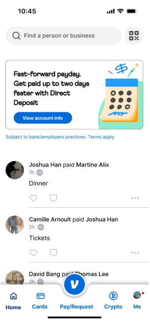
Six steps. Two moments where the experience diverges from domestic.
1
Tap pay/request
2
Select recipient
3
Select pay
4
Enter amount
5
Review & confirm
6
Pay now
Rates are shown
before amount
is entered
Rates are shown
before amount
is entered
How we got there
What’s your intent?
Request or Pay
Request
Pay
Domestic
vs.
Before
Two competing actions

After
One clear intent
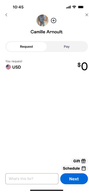
Shift the reference point
The received amount leads.
Domestic
vs.
Before
Sent amount leads

After
Received amount leads

Full visibility before authorization
The mid-market rate.
No markups, no guessing.


Every fee, broken down.
Next case study
AXIS
→
→
88% adoption rate
→
42% increase in engagement
Mobile Design
End-to-end experience


Jo Lee
Product Design